Colour consistency plays a critical role in brand perception. In hospitality, even small colour variations across printed items and fabrics can weaken visual coherence.
This article explains how to manage colour matching across print and textile applications and avoid gradual brand drift.
Understanding Colour Across Different Materials
Colours behave differently depending on the material. Ink on paper, dye on fabric, and coatings on packaging each reflect light in distinct ways.
A colour that looks correct on a screen or brochure can appear different once applied to textiles or textured surfaces.
Define Reference Colours Clearly
Strong colour control starts with clear references. Pantone codes or lab values should be defined as the primary standard for all suppliers.
These references must be shared consistently across print, fabric, and packaging workflows.
Account for Material and Finish Variations
Surface texture, absorbency, and finishes influence final colour output. Matte papers, glossy coatings, and woven fabrics all shift perception.
Adjustments are often required to maintain visual alignment across different substrates.
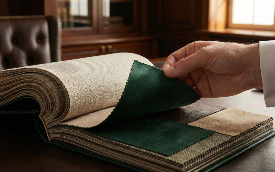
Use Physical Samples, Not Screens
Digital previews are useful but limited. Screens vary in calibration and cannot replicate real-world lighting.
Physical samples remain the most reliable way to evaluate true colour consistency.
Control Production Batches
Colour drift often occurs between production runs. Changes in ink batches, fabric lots, or suppliers can introduce variation.
Documented approvals and batch references help maintain consistency over time.
Coordinate Print and Textile Suppliers
When print and fabric suppliers work in isolation, colour alignment becomes harder to manage.
Sharing reference samples and approval standards across partners reduces discrepancies.
Protecting Brand Integrity Through Colour Control
Consistent colour application reinforces brand recognition across all guest touchpoints.
With clear standards and disciplined validation, hotels can avoid brand drift and preserve visual coherence.
Let's create a world for your guests together

DOWNLOAD CATALOGUE BY SUBSCRIPTION
DOWNLOAD CATALOGUE BY SUBSCRIPTION
ADDRESS
Chemin du Suchet 2
1805, Jongny
Switzerland
+41 21 652 05 09
info@lgbusiness.com