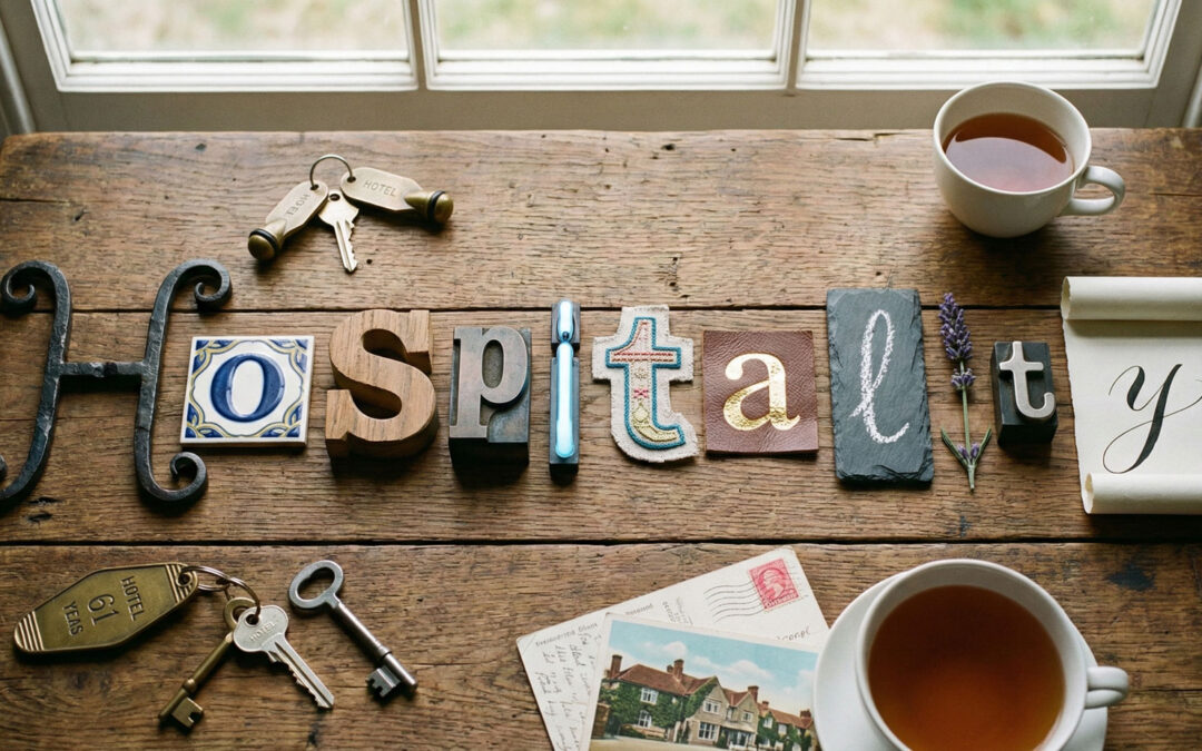
Typography and layout strongly influence how premium physical items are perceived. On amenities, packaging, and printed materials, small typographic decisions affect clarity, balance, and overall refinement.
This article outlines practical typography and layout rules for premium hospitality items.
Prioritize Readability First
Luxury design should never sacrifice legibility. Guests must be able to read labels, instructions, and menus without effort.
Clear type sizes, sufficient contrast, and clean spacing support ease of use.
Limit the Number of Typefaces
Using too many typefaces creates visual noise. Premium items benefit from restraint.
One primary typeface and one secondary option are usually sufficient across all amenity materials.
Respect Hierarchy and Scale
Typography should guide the eye naturally. Brand names, product descriptions, and secondary information must follow a clear hierarchy.
Consistent scale relationships help guests understand information quickly.
Use Spacing as a Design Tool
White space is not empty space. It defines structure and creates breathing room.
Generous margins and line spacing contribute to a composed and confident layout.
Align Typography With Materials
Paper texture, fabric weave, and printing techniques influence typographic choices.
Fine serifs, embossing, or debossing require careful sizing to remain clear on physical surfaces.
Maintain Consistency Across Items
Amenities rarely exist in isolation. Typography should feel consistent across packaging, menus, labels, and accessories.
This coherence reinforces brand recognition throughout the guest journey.
Designing Typography for Long-Term Use
Trends change quickly, but physical items often remain in use for years.
Timeless typography choices reduce the need for frequent redesigns and protect brand longevity.
Let's create a world for your guests together
DOWNLOAD CATALOGUE BY SUBSCRIPTION
DOWNLOAD CATALOGUE BY SUBSCRIPTION
ADDRESS
Chemin du Suchet 2
1805, Jongny
Switzerland
+41 21 652 05 09
info@lgbusiness.com